Welcome to the LnLP Forums and Resource Area

We have updated our forums to the latest version. If you had an account you should be able to log in and use it as before. If not please create an account and we look forward to having you as a member.

Edit Tasks Box Recomendations

Daz

Member
Joined
Oct 22, 2014
Messages
861
Points
43
Location
England
Please don't post about other feature requests in this thread. I have posted this to try and gain support just for improvements to this feature from the community, and don't want it getting lost amongst other feature improvements.
I have read other requests in the forum for this, but it has gotten lost amongst other feature improvement suggestions.

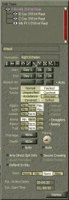
This box is a vital part of the game for me, and I would like it to always be open where I left it on the screen, after a game reload, or starting a new game, even if it starts of blank just as a placeholder.

For those that don't want the box to always be open, at the very least it should open when placing an order on the map, and when clicking on a task waypoint. in the position it was last open in.

There is also about an inch of wasted space at the bottom of it that would be nice to see trimmed, as the box has pride of place on my main screen.
 

Daz

Member
Joined
Oct 22, 2014
Messages
861
Points
43
Location
England
Some people might find it annoying for the box to pop up every time they place an order, so may I suggest a checkbox in the game options, to select this feature e.g {Auto Open Edit Task Box on Selection <on/off>}
 

Daz

Member
Joined
Oct 22, 2014
Messages
861
Points
43
Location
England
Thanks' Erik
I sometimes have issues with it updating, especially with bombard orders, which requires it to be dismissed, and re-opened.
When you re-open the Task the old position on the screen is not remembered, and it defaults to the top left corner of the screen.
This might be a minor bug.

I don't like the way the primary focus task box holds onto the old orders once the task marker has been unselected as I find it confusing as to whether I have properly selected the new task marker, and several times I have adjusted orders on an old order that has no focus, instead of the intended one.

On deselecting a task marker, by clicking on another unit or the background map, I would rather the date in the primary focus Task box was destroyed (made blank). Then I could be sure that when I select the task marker of the new unit it is definitely their tasks I am editing.

A much better use of the extra inch at the bottom of the Task box, and to clear up confusion for me, especially if I was to have multiple task boxes open, would be as in my image below, where the units names that the task applies to is displayed.
Especially if clicking on the unit name at the top of the short OB list, selected the task marker on the map, with an option to centre it on that marker, by holding down Ctrl while clicking.

Another issue with having multiple Task boxes open, is there is no visual indication as to which box has primary focus.
Sample-Task-box.jpg
 
Last edited:

Daz

Member
Joined
Oct 22, 2014
Messages
861
Points
43
Location
England
I have been doing some experimenting, and have discovered a very nice synergy between these three boxes.

The Edit Task box, The Order of Battle box, and the Plan box.

However is falls short of being as useful as it should be for several reasons.
  1. Clicking on a task in the plan box does not centre the map on the task.
    It centres it on the unit instead, but it does update the Edit Task, and the Order of Battle is highlighted with the commander of that task, which is very useful.
  2. Clicking on a unit name in the Order of Battle box, does not highlight the corresponding task in the Plan Box.
    It does however centre the map on the selected unit, which would be much more useful if it was possible to suppress this centring as an option.
  3. Selecting a task on the map, does not highlight that task in the Plan box.
  4. Placing a new order on the map does not update the Plan box unless it is dismissed and re-opened.
Task-Box-Synergy.jpg
 

Daz

Member
Joined
Oct 22, 2014
Messages
861
Points
43
Location
England
This is an image of what I would like to see in the game with regards to the graphical synergy of these three boxes, and the way they fit together.

I have trimmed off some of the flab from the bottom of the Edit Tasks box, lengthened the Plan box so it fits better with the other two, and trimmed off a bit from the bottom of the Order of Battle box as well.

It would be better is we could resize the boxes with scrolling content to our liking of course but we can't have everything we want in life :bigtears:

Task-Box-Synergy-Daz.jpg
 
Joined
Oct 24, 2014
Messages
83
Points
8
Age
69
Location
Groningen, NL
Website
springelkamp.nl
I agree there has to be some fine tuning considering updating other windows when selecting a different unit/task. That could mean quite a bit of work for Dave, so I guess that will happen over a couple of patches as it all irons out.

Priority in my opinion has updating the task window when selecting a unit, because that is needed all the time when playing (but what to do when that unit is not the commanding unit of a task?)
 

Daz

Member
Joined
Oct 22, 2014
Messages
861
Points
43
Location
England
Priority in my opinion has updating the task window when selecting a unit, because that is needed all the time when playing (but what to do when that unit is not the commanding unit of a task?)

I would like to see it go blank to indicate that unit in not the commander of any tasks.
 

Wiggum

Member
Joined
Mar 7, 2015
Messages
391
Points
28
Location
Europe
Very good idea with the unit name in the Edit Task box, thats a must have !
 
Last edited:

Daz

Member
Joined
Oct 22, 2014
Messages
861
Points
43
Location
England
My point 1 that I made in the post above:
  1. "Clicking on a task in the plan box does not centre the map on the task.
    It centres it on the unit instead, but it does update the Edit Task, and the Order of Battle is highlighted with the commander of that task, which is very useful."
was erroneous, as clicking on a task in the Plan box does center the map on the task not the unit.

The reason it wasn't when I tested it out. was because I had the bugged Order of Battle box open, which made it centre on the unit instead.
 

Wiggum

Member
Joined
Mar 7, 2015
Messages
391
Points
28
Location
Europe
Sorry English is not my first language, looks like i picked the wrong word.
 
Top