Welcome to the LnLP Forums and Resource Area

We have updated our forums to the latest version. If you had an account you should be able to log in and use it as before. If not please create an account and we look forward to having you as a member.

Sequential Tasking Poll

Should we ditch waypoints and just have sequential tasks?

  • Retain Waypoints

    Votes: 8 57.1%
  • Ditch Waypoints

    Votes: 6 42.9%

  • Total voters
    14
  • Poll closed .

Greg

Member
Joined
Oct 24, 2014
Messages
47
Points
8
Age
76
Location
Georgia, USA
I have designed three 'Sequential Task Marker' icons if you should choose to use them in your illustration.

There is the Mount Infantry and dismount Infantry, which are the standard NATO Infantry symbol, with arrows going into and out of them respectively.
There is the FUP one that is a HQ flag.

Edit: Added some move formation ones.

Another Edit: Added an alternative icon for Mount and Dismount Infantry, which is the NATO motorized infantry symbol, then with its wheels falling off!

View attachment 4428
Not sure I follow all that DAZ, but i am glad you are on the case. :)
 
  • Like
Reactions: Daz

Daz

Member
Joined
Oct 22, 2014
Messages
861
Points
43
Location
England
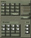
Here is a very quick example of what the Orders box may look like with sequential tasking update.

You would click on one of the orders icon before shift clicking on the map to set that order for that particular leg of the route.
Routes could have multiple orders placed that would apply for that leg, and an expanded set of adjustments that could be applied to that leg by clicking on the marker on the map, then changing them in the Edit Orders dialogue box associated with that marker (waypoint).
The orders would then be played out by the formation assigned that route in sequence as they approached them.

Edit: Added ROF (Rate of Fire). Top to bottom; Max, Norm, Min.

Orders Box.jpg
 
Last edited:

Daz

Member
Joined
Oct 22, 2014
Messages
861
Points
43
Location
England
The movement section and the ROF section ( Supply section, Aggro section, and Losses section to follow as soon I have time to design an icon for them), will have one of their buttons in the sets selected (highlighted).

When one of the Orders from the Orders set above them is clicked, and then placed on the map, that order will take on the attributes of the selected Movement, ROF, etc. buttons in their relevant sections.
They will sticky but to change them you would just click them before placing another Order marker on the map.
All the orders (Tasks) markers have a move element to them, right? All of them first need to move to the location of the order, unless its in situ, (note to self: need to add that to the Movement section), so they will also need a movement formation.
Of course you could just leave it up to the AI, by keeping the default Movement formation button selected. It's that top left icon in the Movement section.

I have been rushing this between jobs, Ill have more time tonight to try to explain it properly, but it takes time to come up with the icon designs, that's what's slowing me down.
I'm also brain storming between posts as I think it through and realize that wont work unless I do this, or that, as well lol
 

Daz

Member
Joined
Oct 22, 2014
Messages
861
Points
43
Location
England
Ok, lets see if makes sense :writer:

See the Orders box bottom left of the screen.
It has two sections, an orders section and a movement section.
Above that is the Edit Tasks Dialogue box. These work very closely with each other.
The Edit Tasks Dialogue is a detailed display of the properties of the currently selected marker (waypoint) on the map, or after selecting an order from the Orders box, contains the detailed information of the next order to be placed on the map updated to include some default settings and some stickied settings carried over from the last order.

For those that didn't know a probe order is just an attack order, but with a different set of default settings (min losses instead of normal). These settings can be changed in the Edit Tasks Dialogue to match those of an attack if you wanted to.
The Movement section of my proposed orders box is just a move order but with the default settings for that particular move formation.
So if you just wanted to move your units from one location to another you would just select the formation icon of your choice from the movement section then click on the map to place the marker. If you wanted to change something else like the speed or timings, you would have to set them in the Edit Tasks Dialogue.
This will help to save you having to dive into the Edit Tasks Dialogue for a simple change of formation as you lay your route and give you a visual reference with that formations icon on the map.

The other task type of orders (attack, defend, withdraw etc.) would use the formation selected in the movement section to move to the task location, similar to how it used to be.
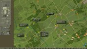
Orders-Example.jpg
 

Dave 'Arjuna' O'Connor

Panther Games Designer
Joined
Jul 31, 2014
Messages
3,416
Points
113
Location
Canberra, Australia
Website
www.panthergames.com
Interesting. I'll nee time to mull it over. One thing that does come to mind is the possibility of saving a customised order settings and then being able to apply it to a particular order via a popup on the Edit Task dialog or some other interface method.

My first reactions.

I can see merit in having the formation icon variants for a Move task. But you may well be more interested in one of the other non-formation settings - eg if Attacks are allowed. If we are getting fancy here then why not have the option to display the task icons by order setting - eg, formation type, attacks, ambush, Bypass, stragglers, basing, route type, speed etc.

Another observation and it may just be a personal style or preference, but I woul tend to lay down the sequence of tasks and then review the settings for all of them adterwords. In which case I would prefer to use the Edit Task dialog and have a sequence navigation control on the dialog (eg arrows like a video control). That way I can just click the next arrow to select the next task in the sequence and I can then make whatever settings I need for it and move onto the next with another click on the arrow.

I would also like the ability to copy the current settings forward or backward throughout the sequence. This could be until a different task type is reached or it could be applied regardless of task type. That way if I make the settings for one and I can apply them throughout with just one click.

We may need a right mouse context menu for order icons too. This could provide an alternate means to copy the settings.
 

Ripppe

Member
Joined
Mar 12, 2015
Messages
50
Points
8
Age
35
Location
Finland
Dave, this is just me being curious. "Don't break it if it's working" they say (btw, what would be the correct English proverb for this as I believe there is one?), but have you considered the possibility to revamp the whole order giving functionality? This could be a suitable instance to at least give a thought or two for the matter. Unfortunately I don't have a neat examples/ideas to give straightaway as Daz has done (you ser, deserve a medal for all the work you're doing in the forums). However, whether a revamp is even a slightest possibility or not, one thing that could help is to think backwards: what are the functionalities players use for giving orders? What are their parameters/data/options? How could these be coupled to make a streamline and intuitive UI to support the goals?

Just some random babble, but maybe it's not completely in vain.
 
  • Like
Reactions: Daz

john connor

Member
Joined
Oct 22, 2014
Messages
2,488
Points
63
Age
60
Location
Brussels
Thanks for the explanation, Dave. I think get rid of waypoints. That gives you one button to use (shift) though sounds like you will need more in future, though I wouldn't worry about that - have you ever tried a complex flight sim? - the key combinations are absurdly complicated, but it doesn't put anyone off. True most get mapped to various joystick functions, I suppose. But CO is hardly cluttered at the moment. I think it could bear modifying clicks with Cntrl and Shift and Alt etc. I also think it wouldn't be too bad if you had to free the pointer by clicking a key or button before selecting a new object, though it's true that it can be irritating. Something similar happens in mapmaker where you have to select the hand symbol before you can move the map, so have to keep changing the pointer function.

Peter
 

Daz

Member
Joined
Oct 22, 2014
Messages
861
Points
43
Location
England
Yeah, there is loads of extra functionality that can be added to the way the new sequential tasks are given and reviewed, as you suggest above Dave.
I just wanted to get over the basic concept of how I thought the new system would work, so that each leg of a route can be given a unique order and how best to assign the FUP.
I actually have a tone of ideas on added functionality of the UI, which is probably inspired by my regular use of the Adobe products that have incredible UI's. This is obviously because of the huge amount of money they have to throw at it and in no way belittles your efforts.
There are however some great ways to take inspiration from them.
 

zardoz

Member
Joined
Jun 14, 2015
Messages
13
Points
3
Age
54
Location
Germany
Just took notice of this subject.
The sequential-task-concept is definitely something I was missing when I played CO1.
ImO it is evident, that preparation movements in many cases do have different premises than the final action.
A game like CO must have the aspiration giving the player a variety of options to design complex planning.
For example I want a formation to get very quickly to a secured area in columns without any additional tasks, but then setting up a complex cautious attack on an objective with several task-options.
I hope that this idea will be implemented in future releases.

Keep simple what doesnt really need complexity. But allow immersion where it brings us closer to the project´s conceptional philosophy.
 
Top