Hey,
just got the game and while I've not had a lot of time to play, been loving the slickness of the new UI, giving more space to that lovely map.
There are a couple of improvements I'd like to suggest. Some of them have probably been mentioned elsewhere...
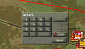
* Close opened dialog with Escape key - not sure if the concept of "active" window applies but maybe just close the dialog with the mouse hovering or last used? Constantly having to find and click Dismiss might get repetitive.
* Double click a unit to open Force Info.
* Double click a task to open Edit Task.
* Dockable windows - probably on the list, just my +1.
* Remember window state, so if you set up your dialogs they will open in that state the next time.
* Improve the text colour of the dialog header? Right now the dark text on grey is kind of hard to read at times, even if it's just the title of the window, so no biggie.
* Hover text on the Main menu, at the start it was kind of hard to figure what menu was where.
At the moment just UI stuff, sure more to come once I dig into the Red Devils scenario properly, and I am sure the hardcore grogs here will have more input on the rivet counting
