Welcome to the LnLP Forums and Resource Area

We have updated our forums to the latest version. If you had an account you should be able to log in and use it as before. If not please create an account and we look forward to having you as a member.

LnLT Digital Board Game Screenshots

Gerry

Member
Joined
Nov 22, 2018
Messages
24
Points
1
Age
69
Location
USA
David put up a video today of me flailing around on the first few turns of Overlord Begins. (I forgot that one of the German stacks hadn't fired yet and walked right into an awful opfire.... and now it's recorded for posterity.). Anyway, it's here: https://forums.lnlpublishing.com/threads/lock-n-load-tactical-digital-preview-video.5187/
I see the terrain looks very dark. Is that just because it is a night scenario? (I am not a fan of wargames out there that make the map look ugly to match the terrible conditions due to weather, season, etc. They do this for immersion I guess but I just like to see a nice green color for fields, etc.). Thanks for the update.
 

Tom Proudfoot

Digital Designer
Joined
Oct 13, 2014
Messages
674
Points
43
Location
Alameda, CA
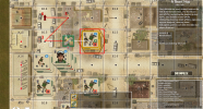
I needed a break from bug-squarshing so here's something different. It's the amusing first results of pathfinding in the world of squares before I add in support for 8 directions into the pathfinding:


squares.png

(amusing to ME, anyway)
 

ChuckB

Member
Joined
Mar 17, 2015
Messages
82
Points
8
Age
55
Location
California
I'm really looking forward to it. One suggestion I would have (from playing other digital boardgame adaptations) is to give the player the option to (a) really see all the (boardgame) steps of what is going on in detail (meaning showing die rolls, application of modifiers, combat calculations etc.) and, ideally pausable; or (b) skip some (or all of that) to play as quickly as possible through a game. The best solution would be to set up the level of information that is shown individually (maybe with some "all" or "nothing" pre-sets). I find it frustrating in some boardgame adaptations some of that information is shown but often only briefly (I remember the digital version of Conflict of Heroes having this issue, I believe) or some adaptions making the whole game mechanics either completely hidden or excruciating long to sit through. Also, there are different ways of presentation - often simply showing the text of what is happening is difficult to follow, even the use of colors or icons can help a lot. I think the digital version of Heroes of Normandy did a great job of showing the die roll modifiers for attackers and defenders really nicely that made it easy to understand.
If all the relevant information is shown in a nice way, this could be more than a great tactical game but also a perfect learning tool for the gaming system.
 
Top