- Joined
- Oct 14, 2014
- Messages
- 2,099
- Points
- 113
- Age
- 59
- Location
- Pueblo West, Colorado
- Website
- lnlpublishing.com
As many of you know, we were not going change the counters but the emails and posts made us re-think that. So we made the maps bigger and took some screenshots of the old Nations At War counters on it. The NaW counter larger and we wanted to let us know what you think. We will do the counters in a style close to the new NaW counters we are also posting here. PLEASE READ EACH Picture Comments to best understand what we are trying showing you.
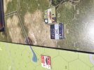
Picture 1: On the left is the original World At War (WaW) game map and counter. On the right is the new WaW map enlarge to hold the larger counters that are provided in the original Nations At War (NaW) games. Please remember these counters are also not rounded as the new counters will be.
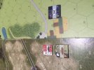
Picture 2: On the left is the new World At War (WaW) game map and both the original WaW counter on top. On the right is the orginial WaW map with a larger counter that are provided in the original Nations At War (NaW) games. Please remember these counters are also not rounded as the new counters will be.
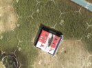
Picture 3: Here is a top down shot of the new WaW enlarge map with the original NaW counter and the original WaW counter on top of it showing how much bigger the new counters should be. Again neither counter is rounded as they will be when made.
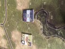
Picture 4: Here is the new WaW enlarge map with two original NaW counters. These counters are not rounded.
Picture 5: This is a new Formation counter for the second edition NaW series. The red in this counter shows what units belong to what formations
Picture 6: This is a new unit with the formation color stripe on its counter for the second edition NaW series. The red in this counter shows what units belong to what formations
Picture 7: Here is a Soviet counter from the second edition NaW with the new font showing all the numbers provided on the counter in an easy to read font.
Picture 8: Please give us your feedback. Here is a German infantry unit. We do not plan on having the helmets only a NATO symbol were the helmet is now.
![WSR-WH-FORMATION-TIGER-[9thPanzer].jpg WSR-WH-FORMATION-TIGER-[9thPanzer].jpg](https://forums.lnlpublishing.com/data/attachments/4/4198-78073e4042e881f1c6e81a8e1dafac3b.jpg)
![WSR-WH-HQ-TIGER-[9thPanzer]-healthy.jpg WSR-WH-HQ-TIGER-[9thPanzer]-healthy.jpg](https://forums.lnlpublishing.com/data/attachments/4/4199-73eb69e61ddee6ea10364699603f21bd.jpg)
![WSR-SOV-SU152-[attached]-healthy.jpg WSR-SOV-SU152-[attached]-healthy.jpg](https://forums.lnlpublishing.com/data/attachments/4/4201-ca6e76490213b24b95a3d318d4ba47ee.jpg)
![WSR-WH-INF-[320stInf]-healthy.jpg WSR-WH-INF-[320stInf]-healthy.jpg](https://forums.lnlpublishing.com/data/attachments/4/4202-a1471c87ac4679dee68abdbffbda13d6.jpg)
Picture 1: On the left is the original World At War (WaW) game map and counter. On the right is the new WaW map enlarge to hold the larger counters that are provided in the original Nations At War (NaW) games. Please remember these counters are also not rounded as the new counters will be.
Picture 2: On the left is the new World At War (WaW) game map and both the original WaW counter on top. On the right is the orginial WaW map with a larger counter that are provided in the original Nations At War (NaW) games. Please remember these counters are also not rounded as the new counters will be.
Picture 3: Here is a top down shot of the new WaW enlarge map with the original NaW counter and the original WaW counter on top of it showing how much bigger the new counters should be. Again neither counter is rounded as they will be when made.
Picture 4: Here is the new WaW enlarge map with two original NaW counters. These counters are not rounded.
Picture 5: This is a new Formation counter for the second edition NaW series. The red in this counter shows what units belong to what formations
Picture 6: This is a new unit with the formation color stripe on its counter for the second edition NaW series. The red in this counter shows what units belong to what formations
Picture 7: Here is a Soviet counter from the second edition NaW with the new font showing all the numbers provided on the counter in an easy to read font.
Picture 8: Please give us your feedback. Here is a German infantry unit. We do not plan on having the helmets only a NATO symbol were the helmet is now.


![WSR-WH-FORMATION-TIGER-[9thPanzer].jpg WSR-WH-FORMATION-TIGER-[9thPanzer].jpg](https://forums.lnlpublishing.com/data/attachments/4/4198-78073e4042e881f1c6e81a8e1dafac3b.jpg)
![WSR-WH-HQ-TIGER-[9thPanzer]-healthy.jpg WSR-WH-HQ-TIGER-[9thPanzer]-healthy.jpg](https://forums.lnlpublishing.com/data/attachments/4/4199-73eb69e61ddee6ea10364699603f21bd.jpg)
![WSR-SOV-SU152-[attached]-healthy.jpg WSR-SOV-SU152-[attached]-healthy.jpg](https://forums.lnlpublishing.com/data/attachments/4/4201-ca6e76490213b24b95a3d318d4ba47ee.jpg)
![WSR-WH-INF-[320stInf]-healthy.jpg WSR-WH-INF-[320stInf]-healthy.jpg](https://forums.lnlpublishing.com/data/attachments/4/4202-a1471c87ac4679dee68abdbffbda13d6.jpg)