This is a post inspired by a post on the Steam forum.
Unfortunately I can't (or just don't know how) include images in my answers on the steam forum.
The post was made by Soulis6 and included some well thought out criticism of the game.
Soulis6: "-Resolution and readability: I was playing on a fairly large monitor, and because of the way the UI scales, much of the text was very very small, and the unit icons on the counters were almost impossible to read. An option to set the scale of the UI (as done in many other games) would solve this problem to some extent, or just making it larger as most players have larger monitors these days.
-Units: The unit counters are very small (related to the UI scale issue somewhat), but they also have general readability problems, for both allied and enemy units. I get why you’d want to have the counter’s designation on there, but I don't think it should be larger than the type icon, or the strength. It would also really help to have a differentiating visual style for vastly different unit types (motorized, infantry, tank, hq, etc), so that it’s easy to see at a glance what it is. (I would love to ditch the unit icons altogether and give them a more stylized look, like in many boardgames or smaller level wargames, but I know many wargamers refuse to give these up)"
This is my reply to his comments on the UI Resolution and readability:
I think what is needed is an extra level of zoom, as some have already mentioned on the LnL website forums in the past.
As the map and probably the counters as well, I guess, are bitmap images, as soon as you go past 100% zoom you will start to see pixilation and things will start to become less sharp.
However, the unit symbols are very hard to decipher at the present size. Of particular concern, is the unit mobility indicator, depicted on units below the unit symbol box. For motorized units, the symbols that depict the wheels are only one pixel in size. Tracks are depicted by a 1px line. These are incredibly hard to see even with my glasses on.
Rather than redesign the unit icons, which would probably result in the unit icons being over large and blotting out most of the map behind them, I would have thought that an extra level of zoom would be a better and easier solution? This would result in pixilation and a less sharp map, and counters, but would make the counters easier to decipher, for the short time that would be required to zoom this close to see what they are. So long as people are aware that the game is designed to be played at the 100% zoom level, and that the extra level of zoom is just for confirming that the unit you thought was motorized, is in fact just regular foot, I don't think people would be overly concerned about the loss of image quality at this level of zoom.
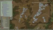
I have included a screenshot of the game which includes a zoomed in section of the map.
I have also included an OOB dialogue box, with what I consider some improvements, that would hopefully be less work than a complete redesign.
- The background has been lightened and flattened to make the mobility indicators on the symbols stand out better.
- Coloured lines have been added to the echeloned structure tree.
- The text has been adjusted to contrast better with the lighter background.
- The size has been increased, but this should be available as a temporary option as it obviously takes up considerable screen real-estate.
