john connor
Member
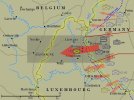
Really like it, Plodder. Very clean and clear.
Should you not place XLVII HQ on the map too?
Should you not place XLVII HQ on the map too?
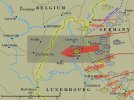
Still like it, but I would now wonder - if I didn't know the scenario - which of all those units I was going to have available. It's possible a little dashed line (for example) around the scenario area box would bring it out more and clear that up. Or maybe not. I feel I would want some kind of firmer connection between the three units between the Korps boundary lines and the greyed out box, making it clear that those alone were the units you would get in that box. And I would like to see, myself, the Korps HQs for each of the three sectors lined up behind the 'line' units, maybe even with command lines joining them to the respective line units? Or maybe that would be too much. It's fine really, I think. Ask for an opinion and it could go on forever......death by committee.....
Hi Plodder,
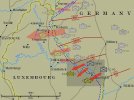
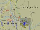
I like what you are doing with this map. Could you do the same layout for the american side showing the different divisions/corps?


