You are using an out of date browser. It may not display this or other websites correctly.
You should upgrade or use an alternative browser.
You should upgrade or use an alternative browser.
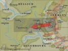
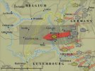
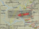
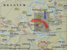
I find the map to be a little bit too crowded but also nicer. Two things: the resolution seems to be too low and I would rather have the counters and the text to less mixed in the map. Probably a less colored map could work fine. Anyhow, it is really a nice piece of work.
john connor
Member
Better without, Plodder, I think, given they're to be relatively small I think it crowds it too much. Imho.
Peter
Peter
The Plodder
Member
Yeah, I'll play around with colours and opacity before I decide whether to drop them. That's the actual size of the map, btw.Better without, Plodder, I think, given they're to be relatively small I think it crowds it too much. Imho.
Peter
The Plodder
Member
Dave 'Arjuna' O'Connor
Panther Games Designer
- Joined
- Jul 31, 2014
- Messages
- 3,416
- Points
- 113
- Location
- Canberra, Australia
- Website
- www.panthergames.com
Rich, maybe you could achieve greater contrast by brightening the background colour of the unit icons. It's not a "biggy" though.
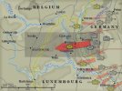
I agree with Dave, probably a less saturated background will work better. I guess that you have to decide if you want a more realistic kind of feel or more "pen and paper" one. I second the last one, i.e. less saturated and brighter background. Anyhow, as I have already said thanks so much for the work I guess it could really improve the immersion in the game.
john connor
Member
Any of these are great, I think, to be honest. I think the main thing is to be able to see (1) roughly - the forces involved, (2) the area involved, and, in addition it's nice to be able to compare these two to (3) the bigger picture. There's nothing else needed, right? And the above version achieves this, and looks good (we could make that '(4)') ....
The Plodder
Member
The Plodder
Member
john connor
Member
Lovely! Great work, Plodder (as ever).
Peter
Peter
- Joined
- Oct 14, 2014
- Messages
- 2,099
- Points
- 113
- Age
- 59
- Location
- Pueblo West, Colorado
- Website
- lnlpublishing.com
Wow very nice.
The Plodder
Member
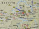
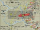
Thanks for all the kind words and comments.  Remember when I said that when I make maps, it's an iterative process? As I was working on Battle of the Roadblocks,which is based off the Race for Bastogne map I'd added some more units and boundaries. I then went back to the Race for Bastogne map and added the units and corps boundaries in the north and also VII HQ which was in Bastogne at the start of the battle. It's then a case of rearranging the other map elements to fit.

The Plodder
Member
Art Hall
Member
very nice Plodder!
The Plodder
Member
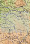
I've started work on the maps for HTTR. This time I'm using a master map which I will then cut to size for each individual SAM. I've got a superb map from 1944 to use as my template, if it wasn't copyrighted I'd just place the units on top and use that. I've now completed the waterways and rail network. I've just got the roads, borders, elevations and towns to go. Not to too much work.  (Actually, it's doesn't take too long as I'm not including everything from the template) The pale area on the map is the size of the standard SAM you see in the game.

Similar threads
- Replies
- 0
- Views
- 1K
