Welcome to the LnLP Forums and Resource Area

We have updated our forums to the latest version. If you had an account you should be able to log in and use it as before. If not please create an account and we look forward to having you as a member.

Cmd Ops 2 Graphical User Interface (GUI)

Dave 'Arjuna' O'Connor

Panther Games Designer
Joined
Jul 31, 2014
Messages
3,416
Points
113
Location
Canberra, Australia
Website
www.panthergames.com
Hi all,

I thought I would start talking about the new GUI for Command Ops 2 (CO2). We are putting in a significant effort to improve the GUI. Probably the first major change is the use of separate dialogs for the data views. We now have a separate Order of Battle (OB) view, force data view, task data view etc and you can manoeuvre these to wherever you like on the screen. You can even drag them onto your second monitor if you are so blessed.
 

Daz

Member
Joined
Oct 22, 2014
Messages
861
Points
43
Location
England
Sounds great Dave.
Is some work being done on the messages tab?
Better filtering, optional pause on events?
 

Dave 'Arjuna' O'Connor

Panther Games Designer
Joined
Jul 31, 2014
Messages
3,416
Points
113
Location
Canberra, Australia
Website
www.panthergames.com
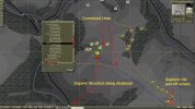
Something's wrong with my ability to upload images. So I am resorting to using a URL to another site. Here goes then.
Command%20Structure%20and%20Lines.jpg
 

Rob

Member
Joined
Oct 22, 2014
Messages
154
Points
18
Location
Vancouver BC, Canada
Hi,

Looks good and sounds awesome!
My pet request is to be able to make/create attachments etc. for customized battlegroups off the OOB as opposed to today's control clicking thru a potentially large group of units in a small space. Will that be a part of the improved GUI??

Rob.
 

luigi

Member
Joined
Oct 21, 2014
Messages
20
Points
1
Age
38
Location
Italy
Very low priority (and picky) requests:
1) please remove the two arrows <,> on the map zoom selection. They interfere with the + and - sign and they do not add anything.
2) please adjust the size of the buttons on the top left according to the text, Reinf does not fit.

Best,

Luigi

p.s. thanks Dave for all the effort you're putting in this game. I like the look of the new gui.
 
Last edited:

Daz

Member
Joined
Oct 22, 2014
Messages
861
Points
43
Location
England
Hi,

Looks good and sounds awesome!
My pet request is to be able to make/create attachments etc. for customized battlegroups off the OOB as opposed to today's control clicking thru a potentially large group of units in a small space. Will that be a part of the improved GUI??

Rob.
This obviously is a very important feature, and I would like to be able to drag and drop them into new formations, but what will happen with the supply when this is done?
Will units that have similar requirements to the new force base, draw from the new formation?

This is preferable especially if the new force has been ordered to penetrate enemy lines, or is involved in the encircling force, where the most direct line to supplies will take them through enemy territory.
There would need to be a warning generated to warn the player that the new force base is not compatible with the unit they are trying to attach if that were implemented.

Or maybe for now, cross attachment should only be possible within the same Regiment, or Brigade with the exception of organic Divisional support units, like Assault Guns, and Anti Tank Guns?
 
Last edited:

Dave 'Arjuna' O'Connor

Panther Games Designer
Joined
Jul 31, 2014
Messages
3,416
Points
113
Location
Canberra, Australia
Website
www.panthergames.com
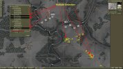
I have been working on providing the ability to select multiple units from the Order of Battle (OB) display. I have made good progress but there is still a fair bit more to do. Previously you could only select one unit in the list. So I have had to add a vector of "selectedUnits". You can now craft your own selection by holding down the Control key and clicking on the units in the list. You can remove a unit form the current selection by holding down the Control key and clicking its entry in the list again. Selecting units in the OB display now selects units on the map. So you can now give orders to the group you just selected, which is pretty cool. Trouble is right now is that as soon as you issue the new order the OB display looses the selection. That will be tomorrows task.

The aim is to sync the map and OB display selections. This is going to require some mods to the ToolSelections class to handle all those cases such as a user clicking on an empty space of the map. This currently deselects the units on the map. It is going to also have to deselect them from the OB display.

Here's a screen shot.
Multiple Selection.jpg
 

Daz

Member
Joined
Oct 22, 2014
Messages
861
Points
43
Location
England
That's awesome Dave :)

A bit of lateral thinking here, but another option would be to have two OOB tabs next to each other.
The OB-Organic Structure, and the OB-Player structure, you could then simply drag the unit from the Organic structure to the player structure, where it will make a new group.

Maybe it would also be possible to drag a counter, or group of counters, from the map to the player structure to add it to the group as another alternative?
 

Dave 'Arjuna' O'Connor

Panther Games Designer
Joined
Jul 31, 2014
Messages
3,416
Points
113
Location
Canberra, Australia
Website
www.panthergames.com
Keep 'em coming Daz. Good stuff. However I am not attracted to the idea of dragging from the organic to the player structure. It could be done but rather than that I would like to add a force group tab to the Orders dialog and allow you to drag from the OB display into it. Then you could do a preliminary selection from the OB display, issue your order and then refine it within this new force group tree tab of the order. In due course I would like to expand on that by adding an additional force group tab - one for the assigned units and one for those in support. The support ones would be under command for fires but not for movement.
 

Daz

Member
Joined
Oct 22, 2014
Messages
861
Points
43
Location
England
Ok here is another one to chew on, although it is a change of subject, sorry about that.

I have been thinking about dismounting the motorized, and mechanized units, after my last comment in my AAR, about vehicles in Polder.

As an abstraction, could the transport vehicles from the motorized units be linked to the supply mechanics?

For example, if you or the AI decide to dismount a motorized unit, they can only get their vehicles back if they can make a valid supply check, after a set amount of time has elapsed to simulate the drive from the vehicle pool to their location, but the vehicles will not be displayed on the map they will just become an abstraction of supply.
Maybe even adding them to the supply base E&S list.

If you or the AI decide to dismount a mechanized unit however, you would need to find a way of spawning an additional counter, that will become another fully functional unit represented on the map, that will represent the support vehicle's, and heavy weapons of the mechanized dismounted infantry.
These can only be re-combined once they are within a set distance of each other.
 

Daz

Member
Joined
Oct 22, 2014
Messages
861
Points
43
Location
England
Sorry about that last post Dave, I know how distracting it can be trying to concentrate on too many things at once.
You end up getting nothing done.
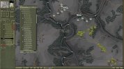
To make up for it I have been working on a better, (I think), cleaner looking OOB list, just for fun lolUI-OOB.jpg

Ill explain what the buttons do if your interested?
 

Jason Rimmer

Member
Joined
Nov 13, 2014
Messages
23
Points
3
Age
53
Location
Liverpool
Dave remember my idea for making the range circles dynamic. So if you click on K98 in the ES the range circle will correspond to this weapon. If none are chosen in the ES the furthest firing weapon is used and the circle will change as losses are sustained and maybe that weapon is no longer in the unit.
 

Dave 'Arjuna' O'Connor

Panther Games Designer
Joined
Jul 31, 2014
Messages
3,416
Points
113
Location
Canberra, Australia
Website
www.panthergames.com
Nice idea.:)
Dave remember my idea for making the range circles dynamic. So if you click on K98 in the ES the range circle will correspond to this weapon. If none are chosen in the ES the furthest firing weapon is used and the circle will change as losses are sustained and maybe that weapon is no longer in the unit.
 

Daz

Member
Joined
Oct 22, 2014
Messages
861
Points
43
Location
England
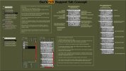
I don't know if you remember this from the other forum, but I thought I would post it here as maybe you can get some idea from it.
I know it would be a lot of work to display everything in this image, but what I would like to see as a bare minimum in the FS tab is:

  1. The unit name or counter.
  2. The size or calibre of its predominant guns.
  3. Its level of fatigue.
  4. The number of rounds remaining.
  5. Most impotently a very low opacity overlay on the map, within its bombard range circle to indicate that it is in range of the zoomed in portion of the map you are looking at.
    This is because often you can't see the outside of the range circle without zooming out.
    I guess it could also be done with an indicator on the mouse curser/bombard box.
    Maybe even more useful would be having the numerical range, dynamically displayed on the curser or bombard box as you move it about, with red character stroke to indicate when it is out of range, and a green one to indicate when it is in range.
    Possibly an amber colour to indicate some of the units it is grouped with are out of range, if it is the leader of a group, and some of the grouped units are out of range, or out of ammo.
FS-presentation-edit-a.jpg
 
Last edited:
Top